Product ManageMENT
Convoz
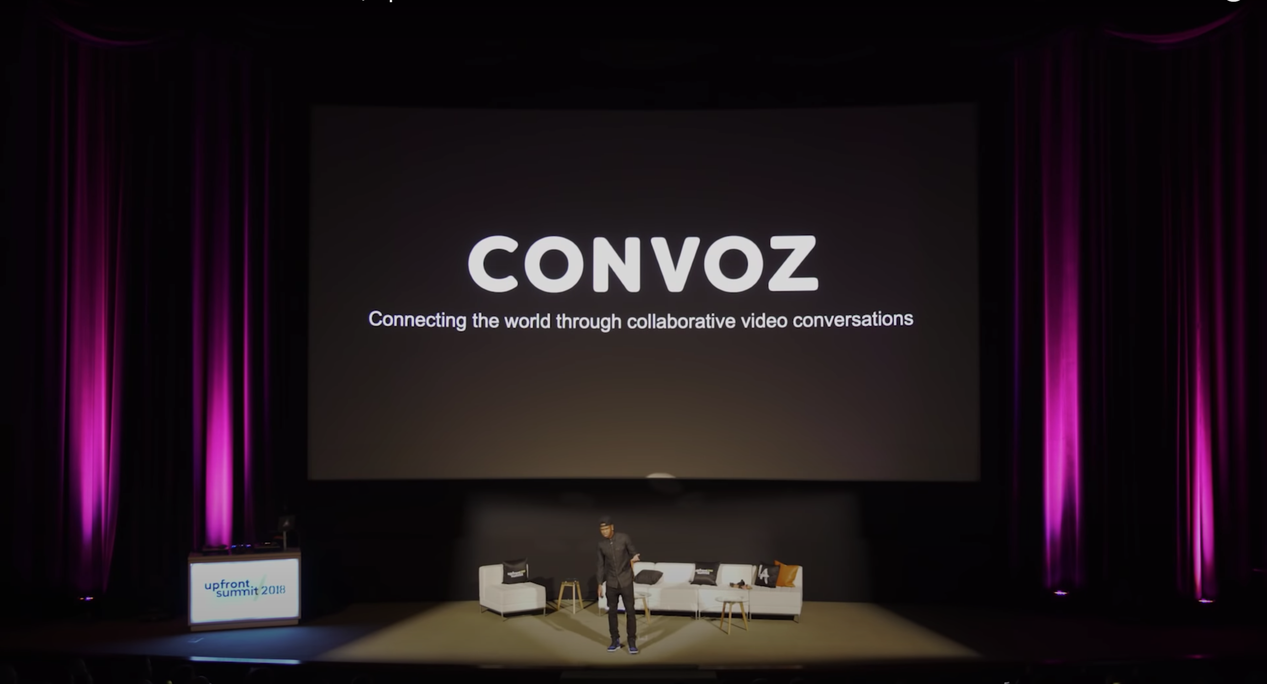
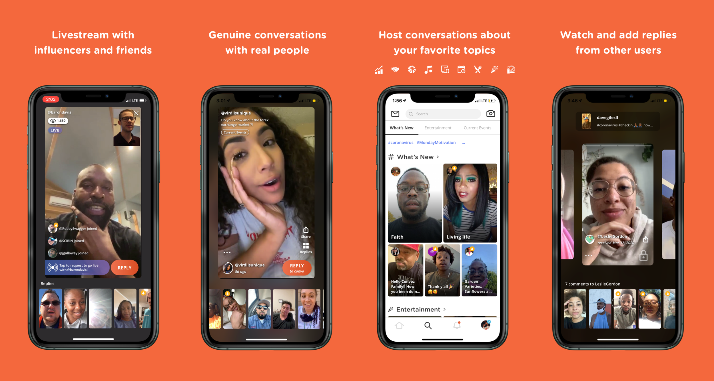
Convoz is an app for creating public collaborative conversation through video. It is a video-centric platform which aims to be “the place where you go to talk to people.” Users can create a convo to share their opinions and receive video responses from others. A convo allows individuals to communicate face-2-face sharing their thoughts and feelings as if they were speaking in the same room.
2019-2021
Roles
Product Development
Audience Development
OBJECTIVE
Simplify user experience to improve retention.
Develop new features to increase user base.
Position the product amidst the industry’s leading platforms and bolster their goal of improving the culture and interpersonal quality of digital communication across Social Media apps.
Pivot the product to meet society’s new virtual demands and maximize its relevance amidst the COVID-19 pandemic.
CHALLENGES
Overcoming the glut of video-based communication apps on the market and competing with the big 4 Social Media apps with the largest market share, for screen time.
Developing a product that rivals our competitors, with roughly 1-10% of the development resources at their disposal.

Case Study: Notifications
Secondary Logo
Inspired by the progress animation shown when recording a video clip in the app, as well as the letter C.
PROBLEMS
I redesigned the notifications UI to address the following concerns:
A high frequency of notification alerts for popular users, due to a lack of grouping and unnecessary triggers.
A lack of productive actions being taken from the notifications feed, such as following, replies or post creation.
Reports of confusion from users regarding where to access responses to their Convos.
SOLUTIONS
I designed the following UX changes:
Removal of the “Open Inbox”, a secondary queue for accessing asynchronous responses that was modeled after UI conventions found primarily in text-based Social Media app — but removed the value of showing the responses in the Convo, as depicted above.
An as-yet unreleased sub navigation with tabs to sort alerts into “All” notifications or solely “Messages”.
I designed a suite of new icons to:
Enforce the logic model behind our new streamlined palette.
Encourage content creation and app management from the notifications feed.
I added the following new UI elements
Grouped avatars to support notification grouping.
Convo thumbnails to increase clarity around accessing user responses, and ease potential friction caused by the removal of the Open Inbox.
Replaced the Convoz Help avatar with our new logo in a larger size, to introduce the updated branding and suggest that our in-app messaging is of greater significance.
Case Study: Discover Feed
Email Template
incorporates UI elements from the app to create a seamless experience when leaving to take actions, such as confirming your email or recovering your password.
PROBLEMS
I redesigned the discover feed UI to address the following concerns:
A significant dip in Trending Topic clicks.
A lack of curation, resulting in low retention and fast churning.
Low click rates on the category-based sub navigation and unnecessary pages loading, due to click out links.
SOLUTIONS
I designed the following UX changes:
Complex, side-scrolling sub navigation which doubles as a jump link menu and a vertical page scroller.
Hierarchy of categories driven by machine learning algorithm, predicting ideal content according to user preferences.
I designed a suite of new icons to:
Introduce category icons to support future implementation throughout app.
Enforce the value of categorization
Aid user’s hierarchical need to sort information.
I updated the Trending Topic UI:
Updated color according to new logic model and prioritized it above Convo curation.
Streamlined size to leave room for preview of curated category.
Add ability to click ellipsis and view additional popular hashtags.
New Feature: Live Streaming
SUMMARY
I designed an unprecedented live streaming feature (in beta) including:
Asynchronous video responses that can be accessed by viewers and played by the host.
Up to three co-hosts on screen at a time, and the ability for the primary host to moderate full-screen views or mute guests.
Shareable and interactive pre-recorded promotional videos for announcing live streams.
Tipping and monetized co-hosting with celebrities.


